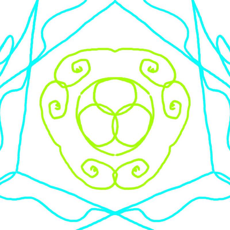
1. the first kaleidoscope I did is simple. I used simple lines to make a design. the different lines I used come together to make the kaleidoscope.
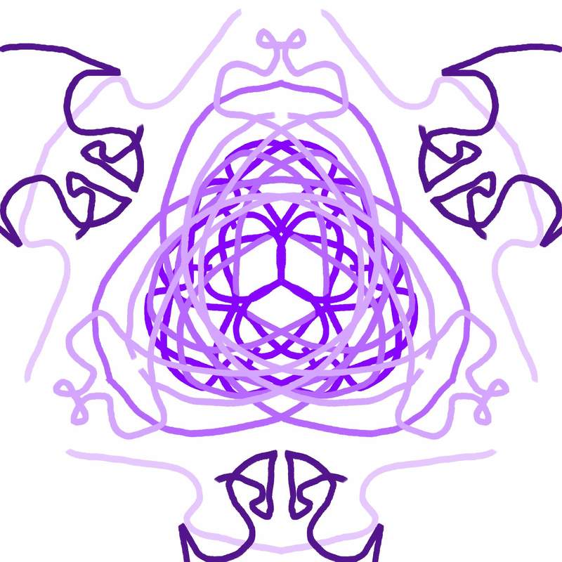
2.i used different shades of purple for this kaleidoscope. using different brush strokes and colors helps to show the different pieces of the kaleidoscope.
3. this time I used different brush strokes, shades of color, and different brush sizes. these elements of art help pull the kaleidoscope together to make it look more complex.
4. I tried using bigger and smaller brushes for this kaleidoscope. using the different brush sizes to show the difference between them.
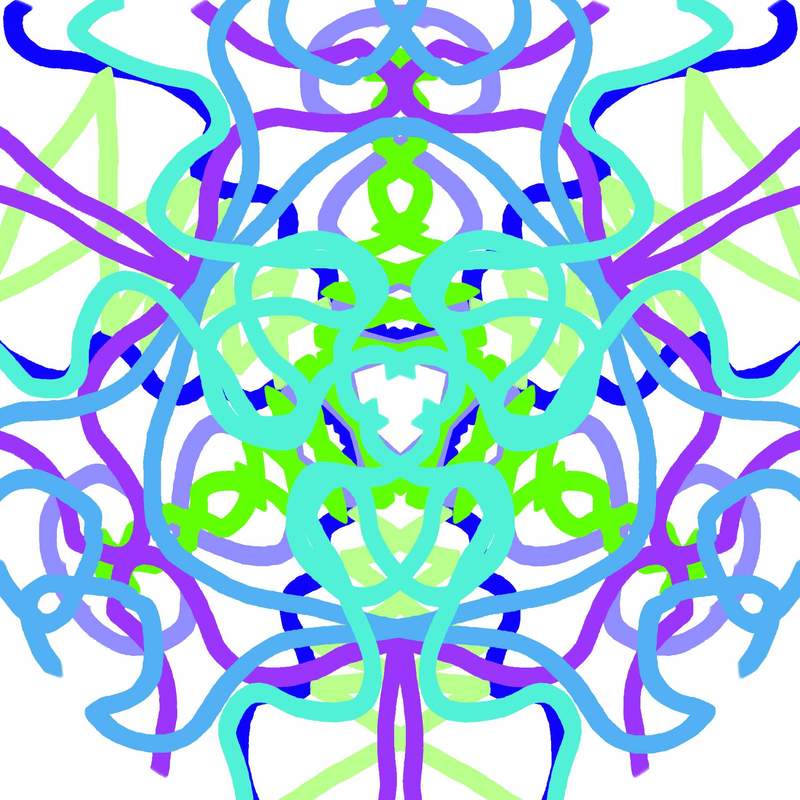
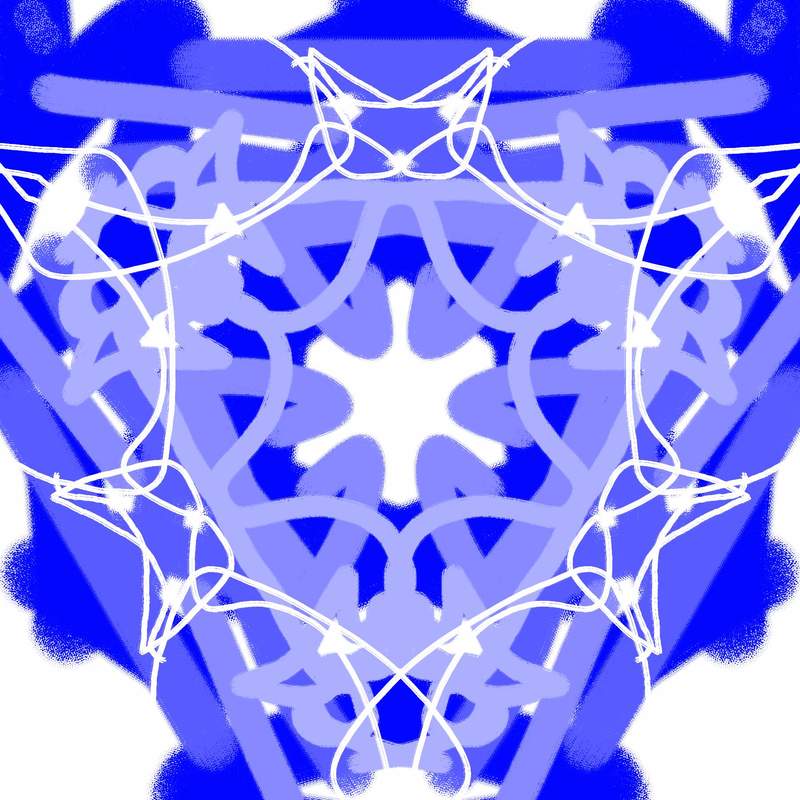
5. in the kaleidoscope I used big lines and bright cool tones to try and pull the shapes together. this one is more complex compared to the other ones because it has more layers than the other kaleidoscopes.
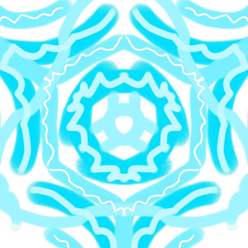
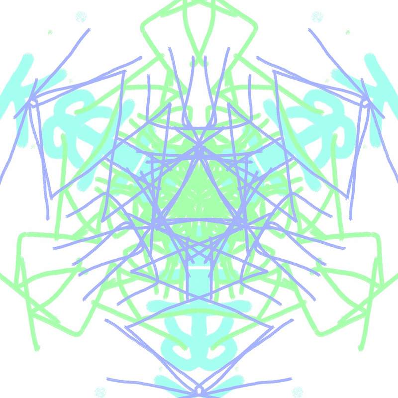
6. this kaleidoscope I used cool tones and light colors as well. the brush strokes are small which makes the kaleidoscope look smaller as well.
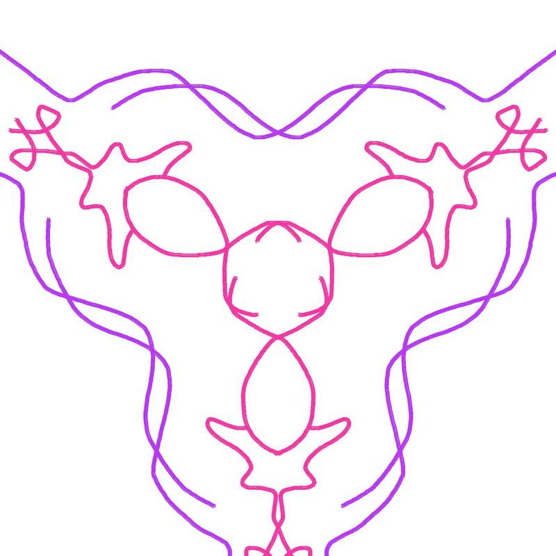
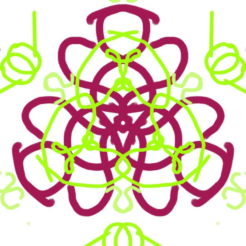
7. this kaleidoscope is simple and uses small lines and warm tones of purple and pink.
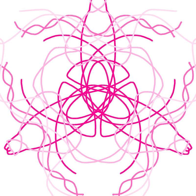
8. this uses different shades of pink. going from dark shades in the middle to lighter shades on the outside shows the different shapes in between the shapes.
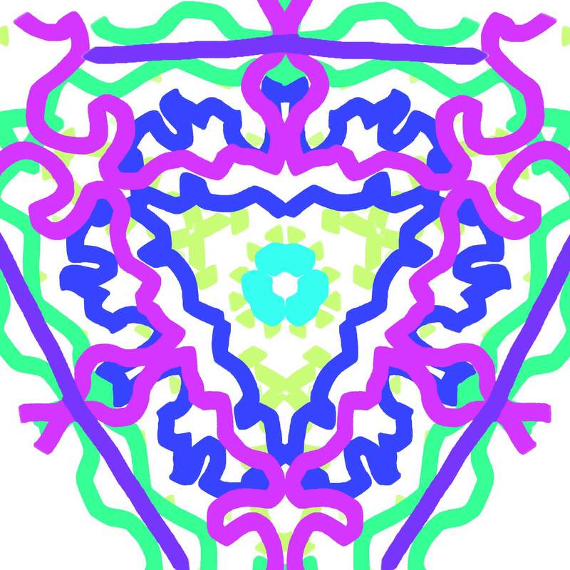
9. I used bigger brushes in the background to make the back look more colorful and used lighter shades of blue towards the middle of the kaleidoscope.
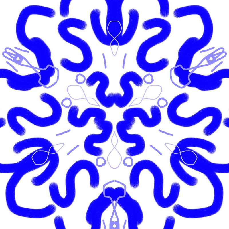
10. this kaleidoscope has elements of value and lines and I used colors that clash together very well and look good together.
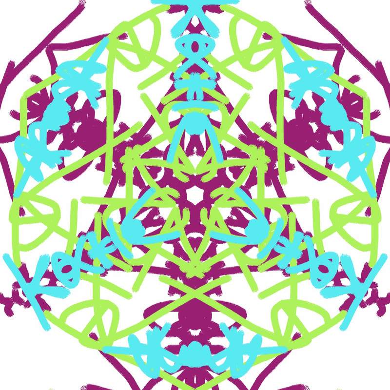
11. color and lines are the main elements in this kaleidoscope and it is one of the more complex ones with all the different varieties of lines and colors used throughout the kaleidoscope.
12. value and color are the main elements in this kaleidoscope. the value is showed in different layers through the kaleidoscope and color is shown through the different colors in the layers as the kaleidoscope as a whole.
2.i used different shades of purple for this kaleidoscope. using different brush strokes and colors helps to show the different pieces of the kaleidoscope.
3. this time I used different brush strokes, shades of color, and different brush sizes. these elements of art help pull the kaleidoscope together to make it look more complex.
4. I tried using bigger and smaller brushes for this kaleidoscope. using the different brush sizes to show the difference between them.
5. in the kaleidoscope I used big lines and bright cool tones to try and pull the shapes together. this one is more complex compared to the other ones because it has more layers than the other kaleidoscopes.
6. this kaleidoscope I used cool tones and light colors as well. the brush strokes are small which makes the kaleidoscope look smaller as well.
7. this kaleidoscope is simple and uses small lines and warm tones of purple and pink.
8. this uses different shades of pink. going from dark shades in the middle to lighter shades on the outside shows the different shapes in between the shapes.
9. I used bigger brushes in the background to make the back look more colorful and used lighter shades of blue towards the middle of the kaleidoscope.
10. this kaleidoscope has elements of value and lines and I used colors that clash together very well and look good together.
11. color and lines are the main elements in this kaleidoscope and it is one of the more complex ones with all the different varieties of lines and colors used throughout the kaleidoscope.
12. value and color are the main elements in this kaleidoscope. the value is showed in different layers through the kaleidoscope and color is shown through the different colors in the layers as the kaleidoscope as a whole.
